TYLENOL
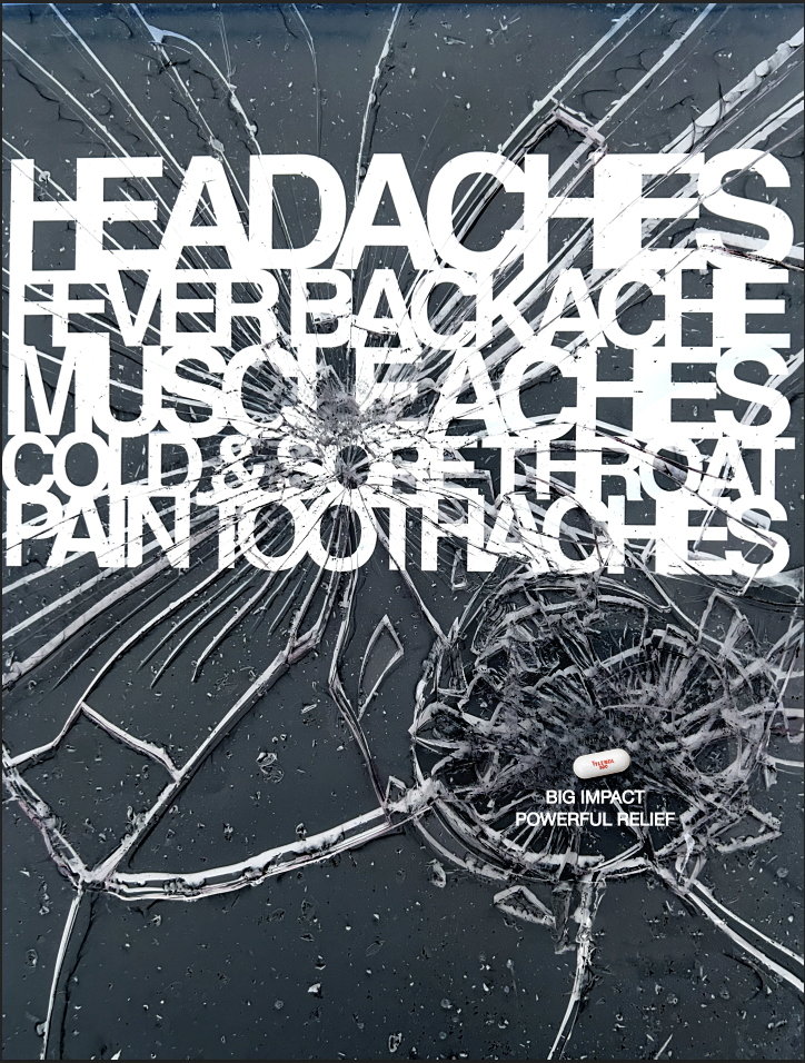
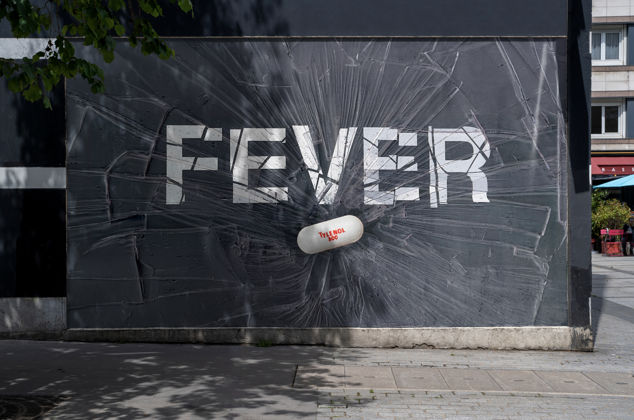
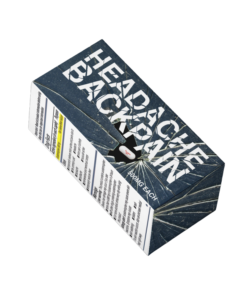
All shattered glass photography was created physically for the campaign.
Insight
Pain relief advertising often focuses on comfort and calm reassurance. This campaign reframes Tylenol as an active force — positioning relief not as passive recovery, but as decisive interruption of pain.
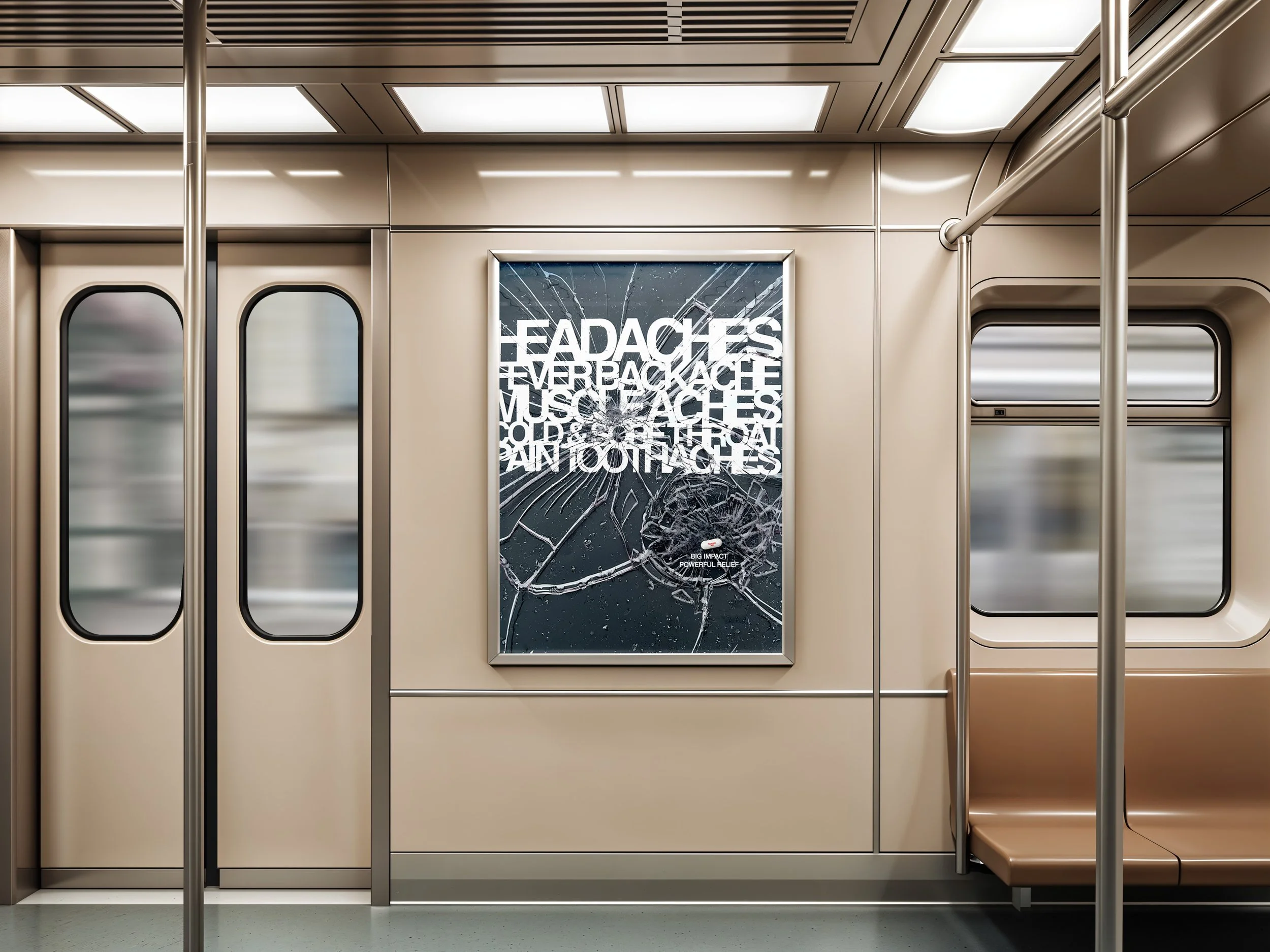
Destroy Pain is a bold, limited‑run campaign that reimagines Tylenol as a powerful voice in a sea of visual noise. Built entirely through expressive typography and stripped of traditional imagery. Designed to cut through fast‑moving digital and urban spaces.
Role & Scope
-
Art Direction, Typography, Copywriting
-
Limited time Packaging
Wall Mural
Poster
Campaign Behavior
Designed for fast-moving urban and social environments, the campaign relies on bold typographic interruption to stop viewers mid-scroll or mid-stride.
The project explores how typography alone can carry emotional intensity, allowing brand messaging to emerge through impact rather than imagery.
Concept
“Destroy Pain” treats relief as confrontation. Expressive typography and fractured surfaces visualize the moment pain breaks apart, creating a visual language built on impact and urgency.