KNEECAP Tour Campaign
The project reimagines visual materials for Kneecap through a unified tour campaign identity. Known for politically charged humor and cultural defiance, the band’s energy informed a graphic system built around confrontation, immediacy, and DIY rebellion.
Role & Scope
-
Concept development, art direction, and visual execution
-
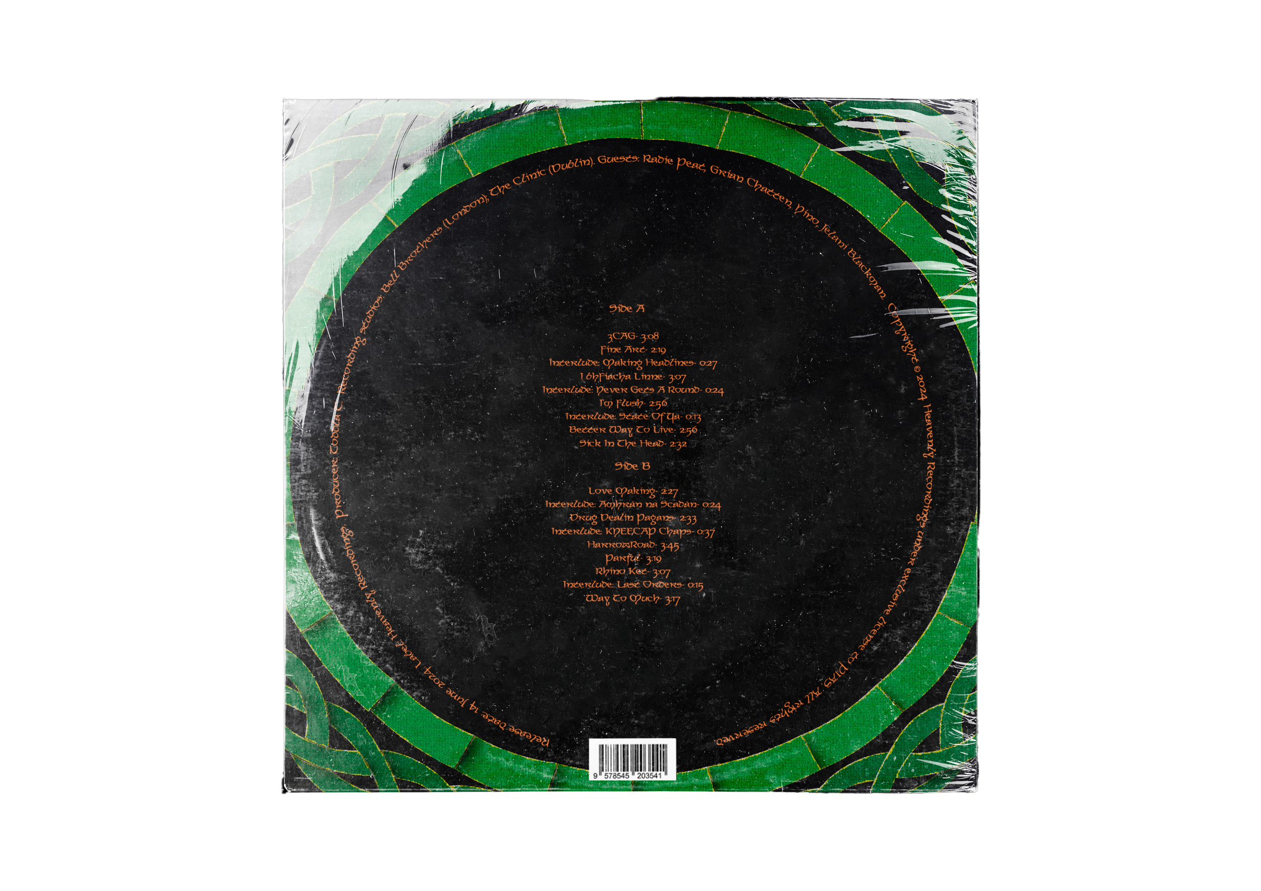
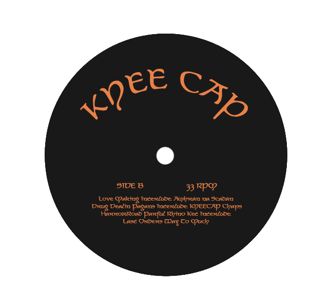
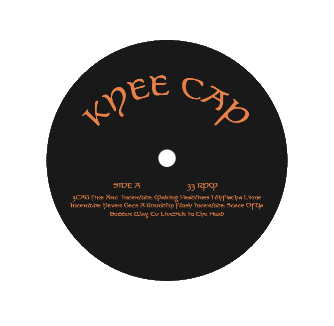
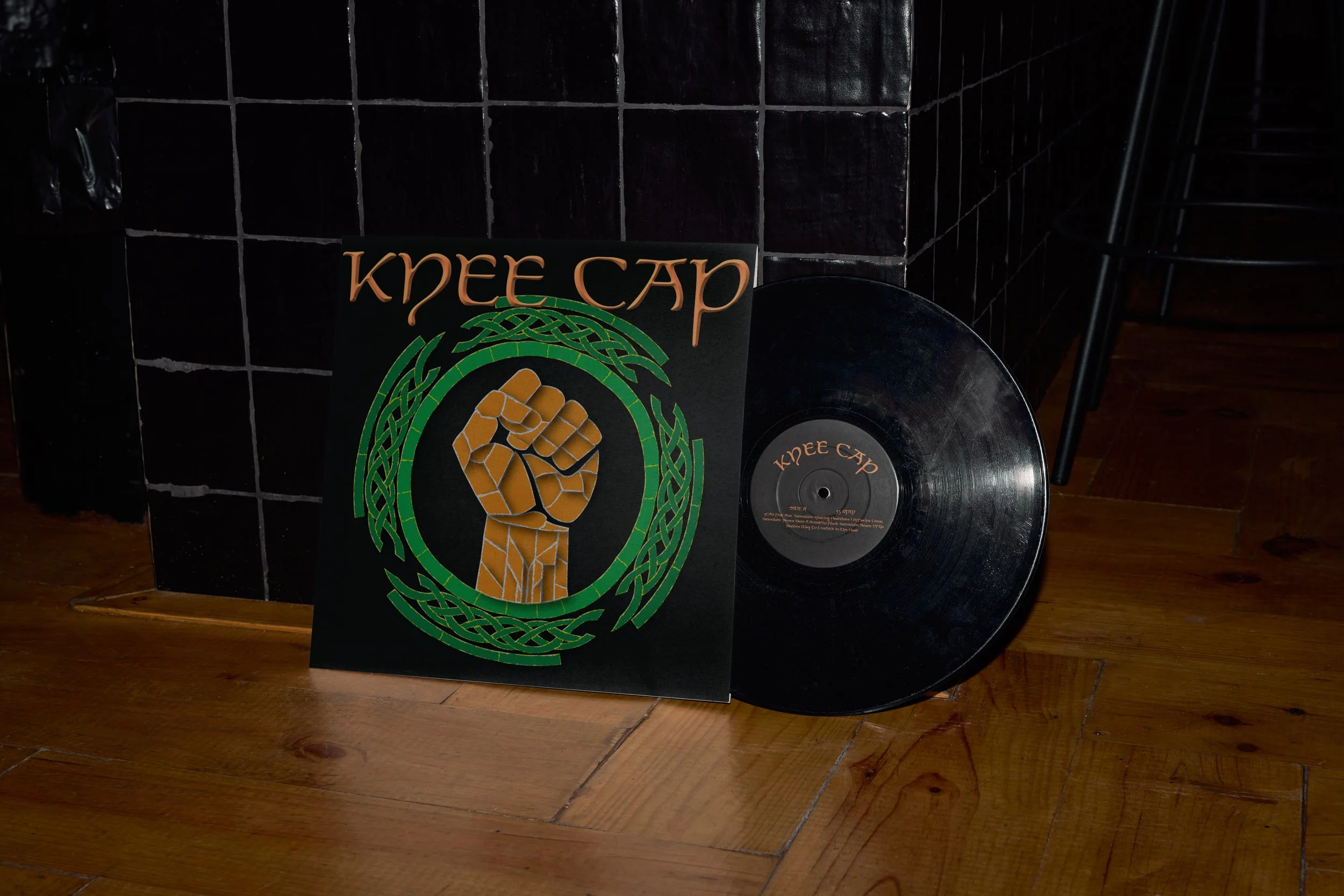
Vinyl cover redesign (w sleeve & record stickers)
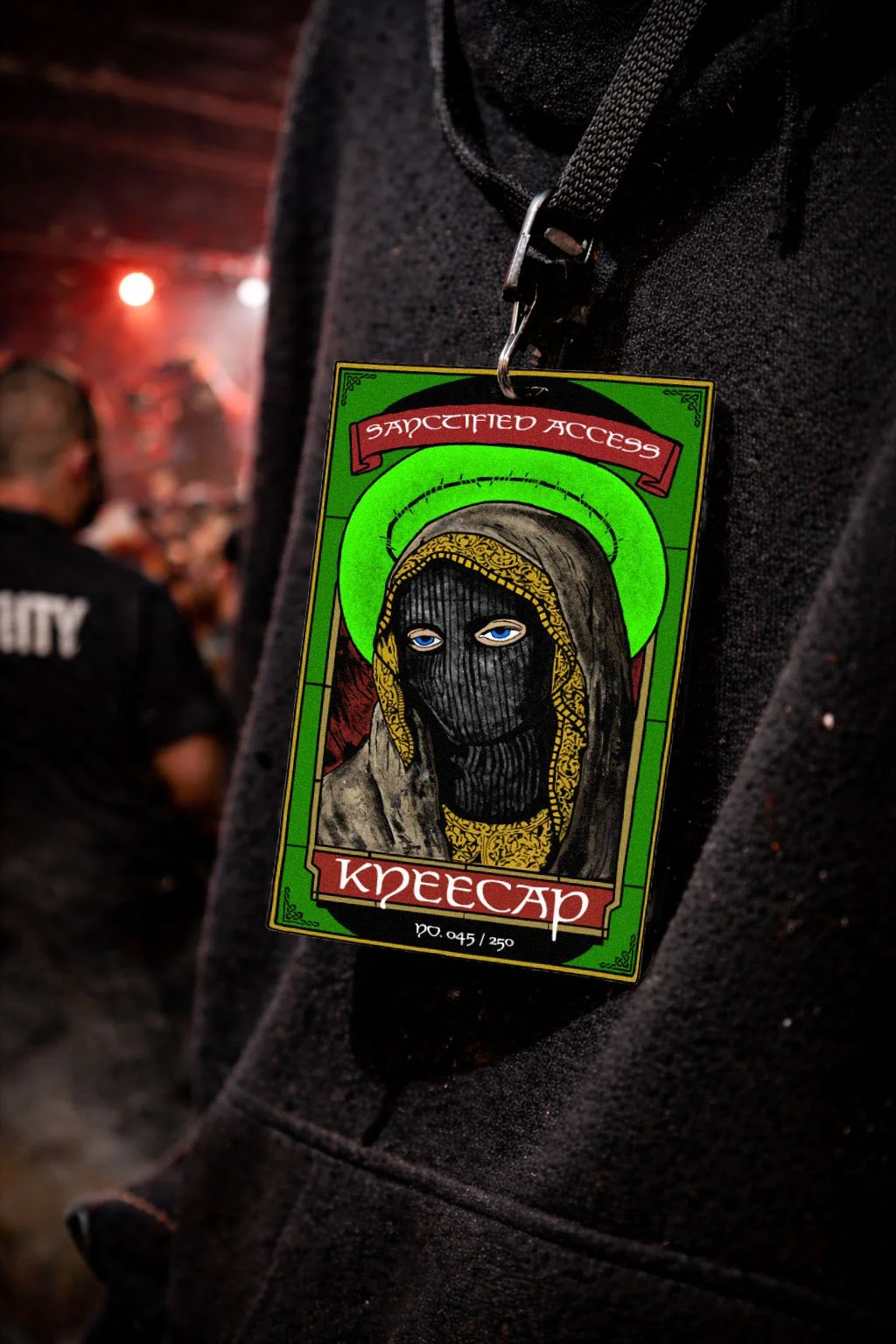
VIP Badge
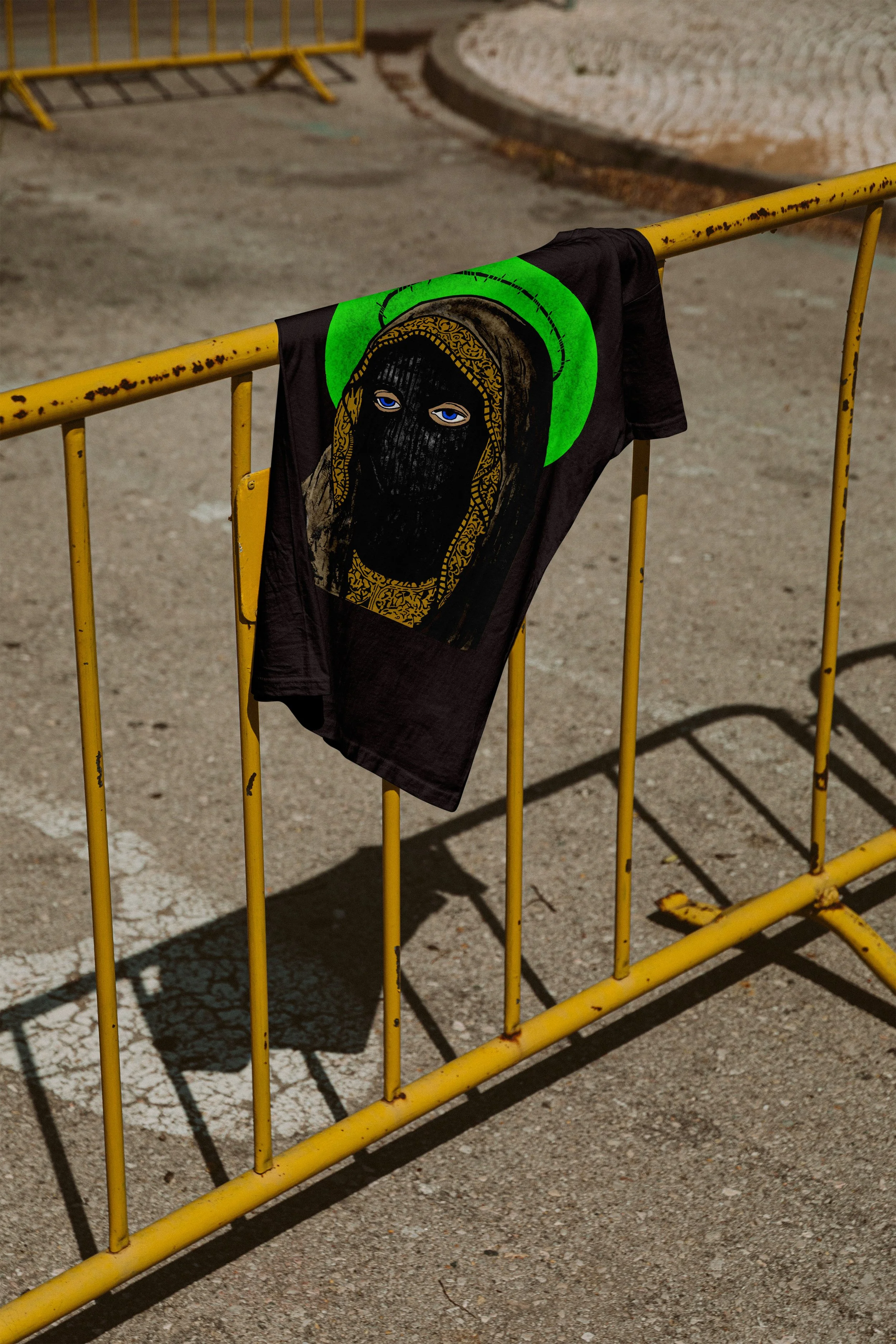
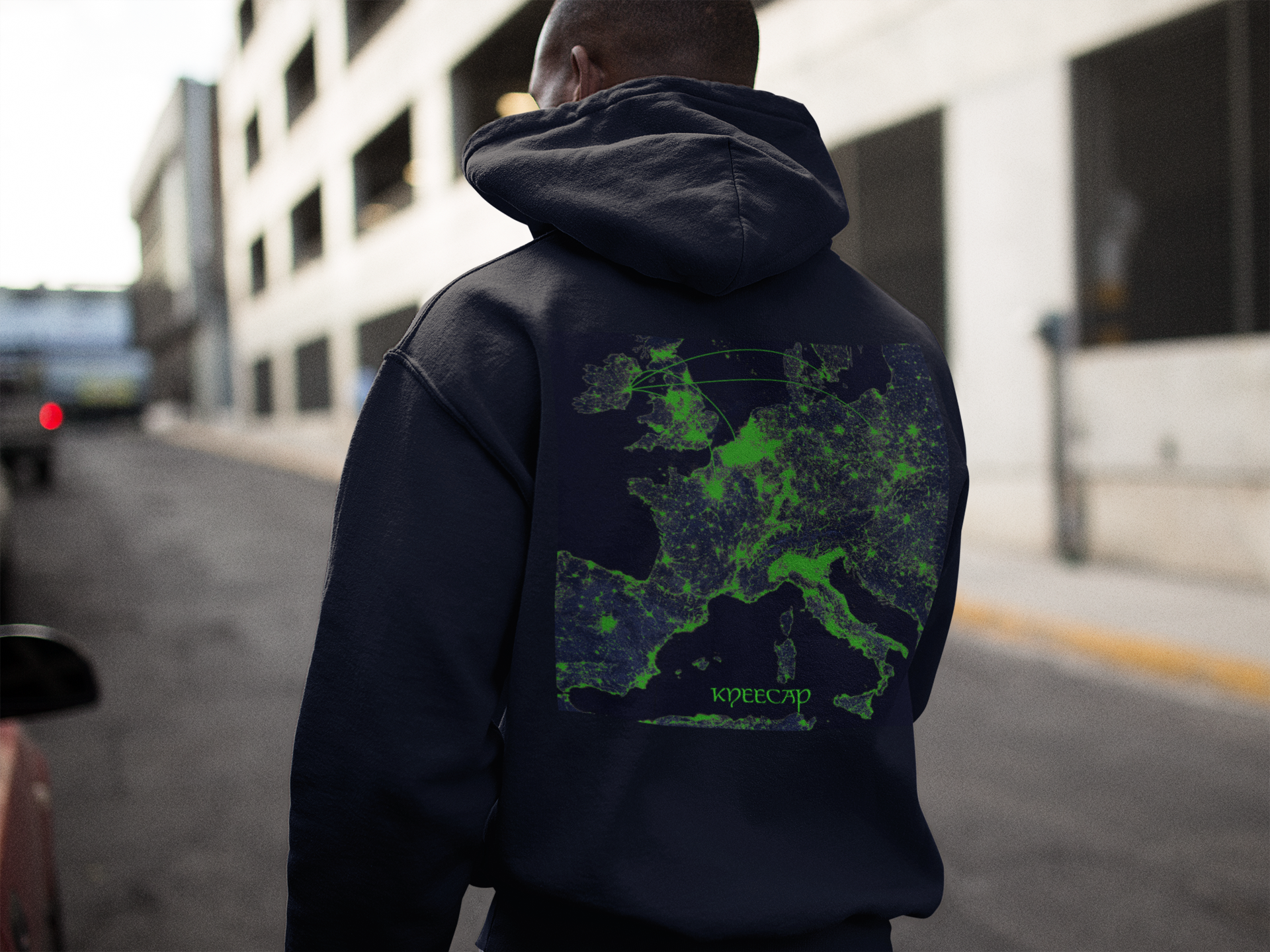
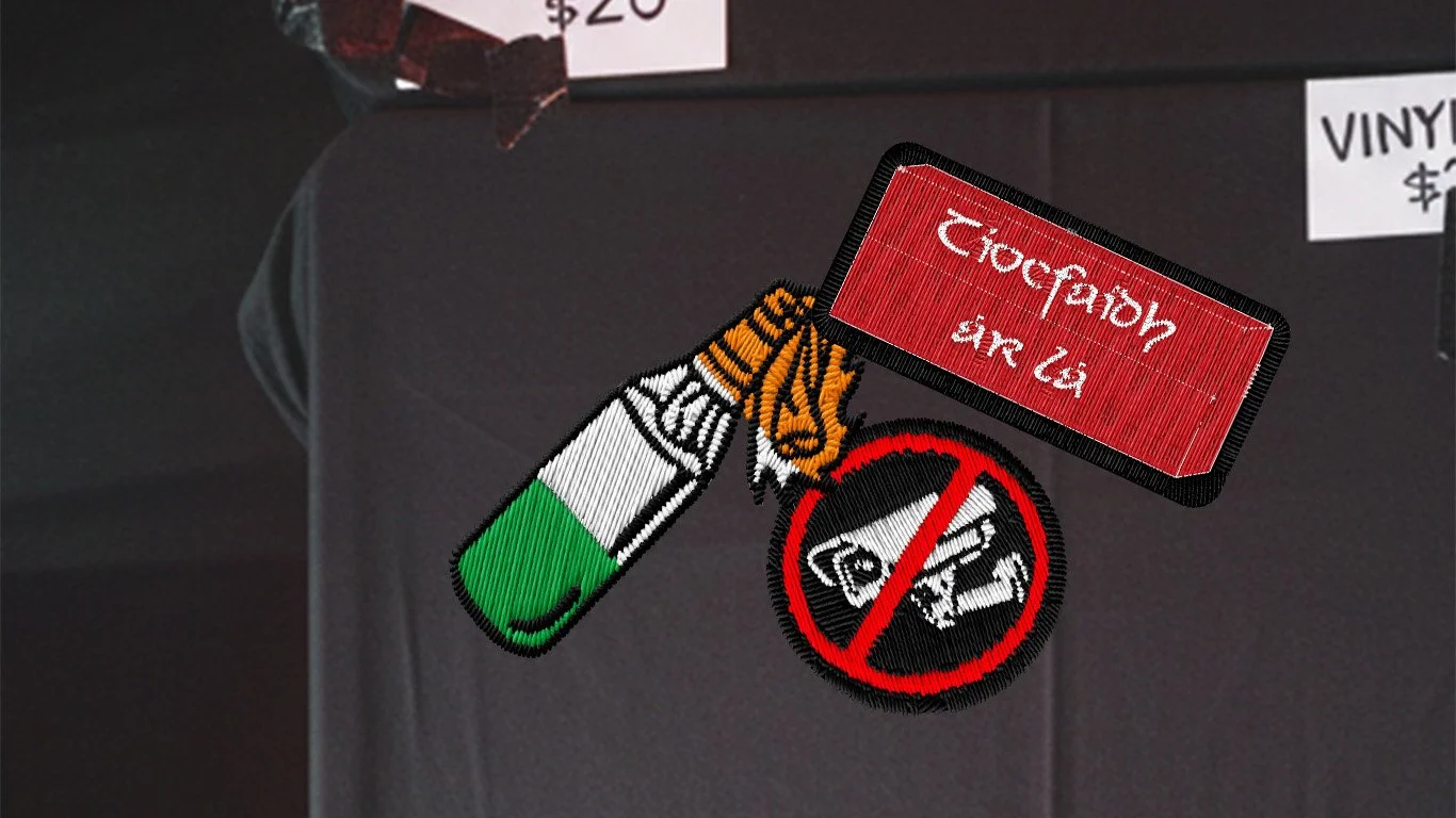
Merch (T-shirt, hoodie, patches)
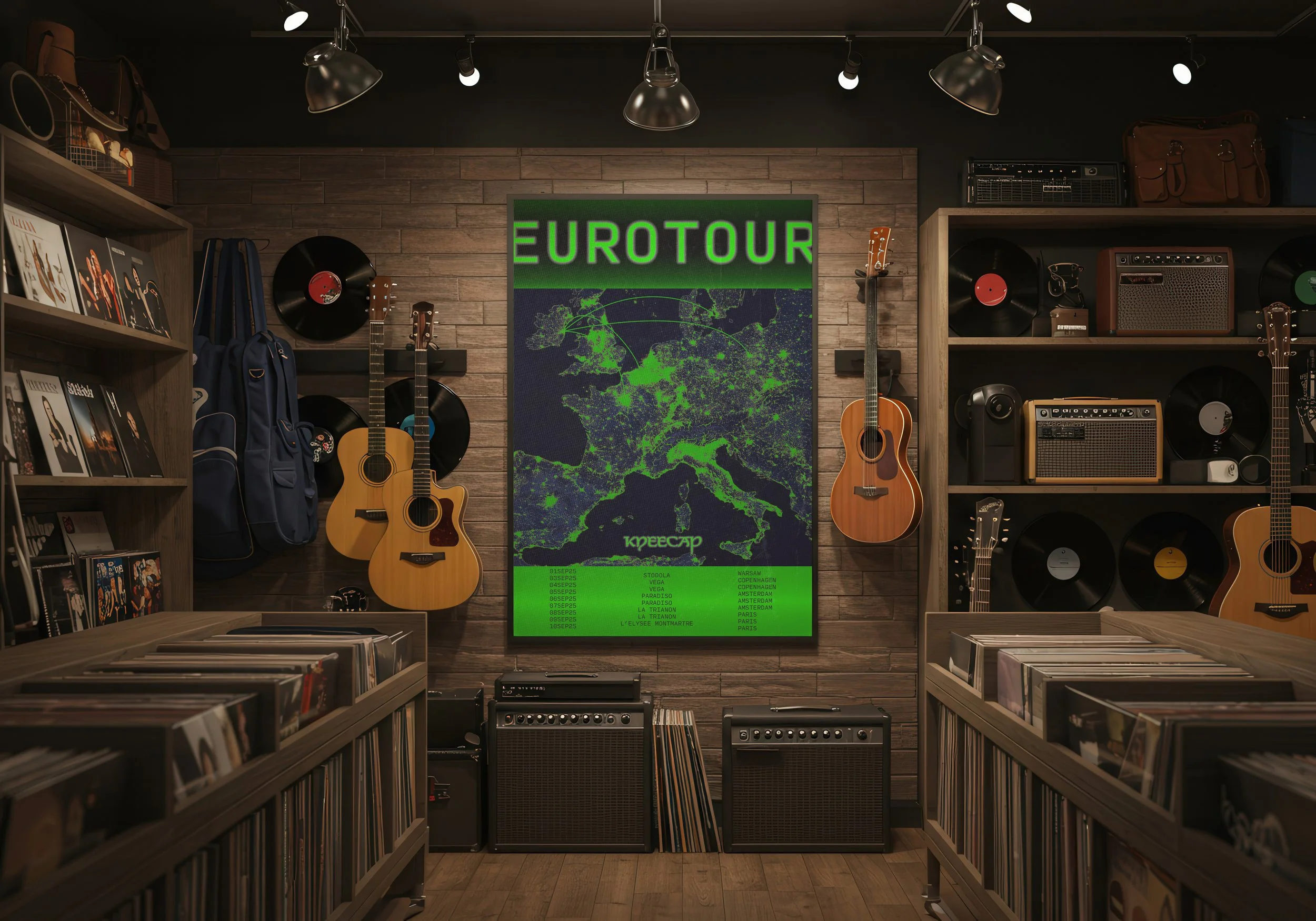
Promotional poster
Visual System
The campaign translates Kneecap’s confrontational political voice into a raw visual language inspired by underground gig posters and protest graphics. Bold typography, distorted imagery, and modular layouts create a system that feels improvised yet cohesive mirroring the band’s rebellious identity.
Applications
The system was built to scale across a tour rollout starting with key posters, then extending into merchandise and physical music formats so each asset can stand alone while still reading as part of the same world.
This project explores how a visual system can carry attitude across formats, allowing identity to emerge through repetition, disruption, and scale.
Challenge
Create a unified tour identity for Kneecap that feels DIY and confrontational without losing readability across fast-glance formats (posters, merch, and vinyl packaging).