PRocess
Book
Audience Discovery
Busy professionals, both working individuals and couples
Household income of 80K
On average, they purchase 7-8 items for a total of about $50 per visit.
They value savings but don’t want to sacrifice quality
CUstomer Persona
Olivia Martinez

Demographics
Age: 34
Occupation: Single parent and part-time retail worker
Location: Minneapolis, MN
Family: Two kids, ages 6 and 9
Lifestyle: Juggles work, childcare, and budgeting every week
Shopping Habits: Relies on pantry programs and local food banks to supplement groceries
Goals & Motivations
Wants to give her kids a sense of normalcy and dignity when accessing donated food
Looks for pantry items that feel like they belong on a real grocery store shelf not leftover or “charity-branded”
Believes visual cues like color and friendly packaging make a big difference in how kids perceive meals
Values clarity, joy, and ease when picking out items with her kids
Aesthetic Preferences
Bright, bold packaging makes her kids light up
Appreciates designs that feel happy but not childish and organized but not clinical
Drawn to friendly illustrations, big type, color-coding, and clear visual hierarchy
Loves when her kids feel excited to pick items from the shelf—like they’re shopping, not “receiving help”
Why This Design Speaks to Olivia
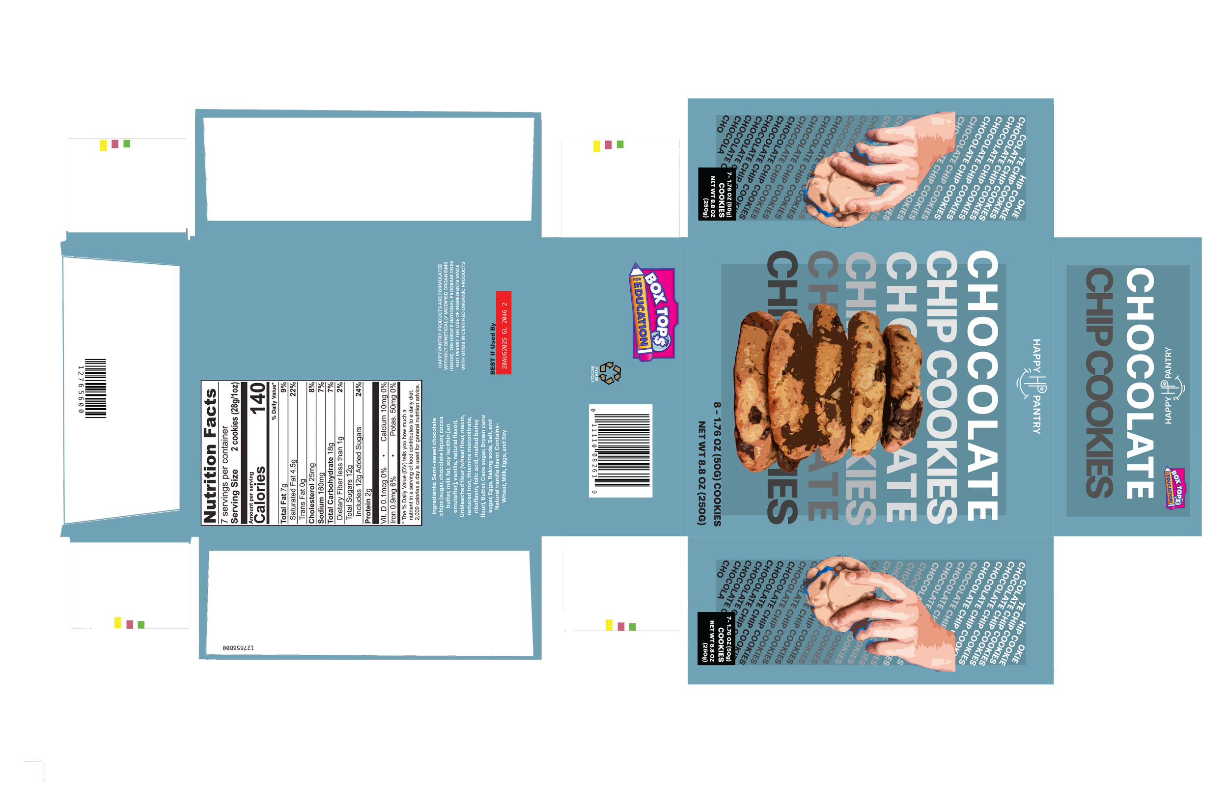
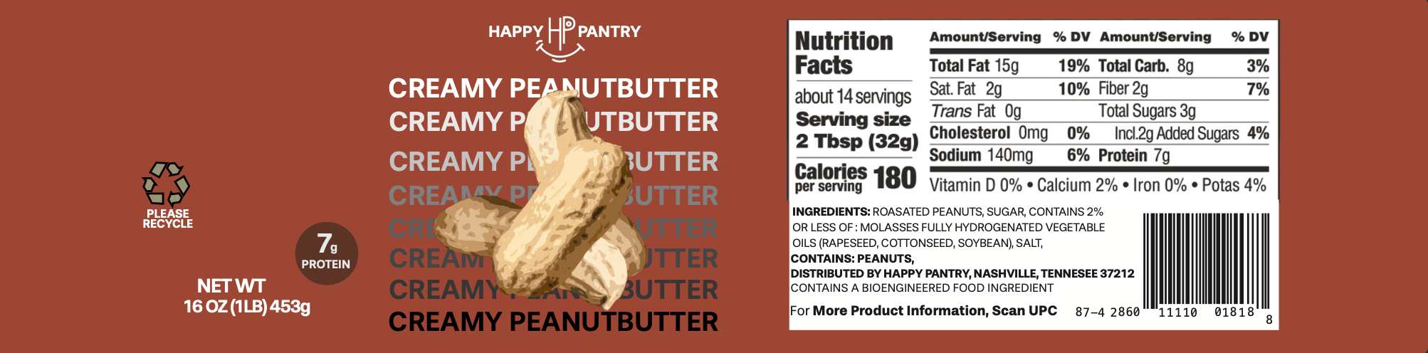
The Happy Pantry brand reframes donated food as something joyful and empowering
Its cheerful packaging and friendly labels make the pantry experience feel more like a store and less like a struggle
Her kids are excited to choose items with bright colors and playful names. Helping them feel included
For Olivia, the design restores dignity and choice in a system that often overlooks those things
Logo Concepts


FONT EXPLORATION

**WINNER**


color palette

254441

71A2B6

CD4631

E1D89F
DIE CUTS